We take a look at the new look MLL franchises ahead of the 2021 season, and give our opinions on who got it right, who got it wrong, and who didn’t bother trying…
1. 2 Gurleys 1 Kupp
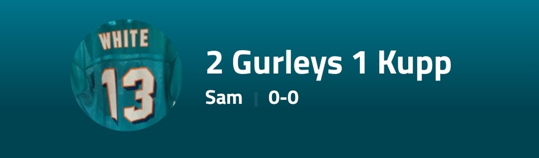
“If it ain’t broke don’t fix it” is the official word from White Camp this year as they keep the classic 2G1K look from 2020. as Reigning champs they have decided to focus efforts in other areas, but some suggest this lack of innovation could come back to bite them in an ever evolving MLL. 5/10
2. Sandymoor Ravens
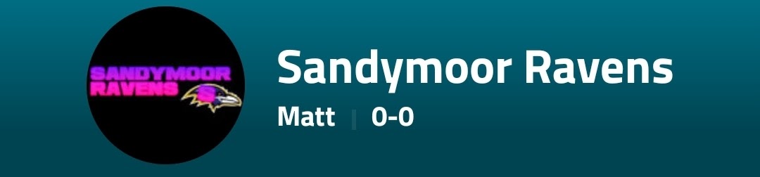
Where do we start here…
MattMossMandem enjoyed a prolific 2020 season which due to some unusually shrewd acquisitions from the GM such as Kelce and an 8th round kicker saw them take the runners up spot in the 2020 MLL Season. Perhaps it would of been smart then to stick to the solid foundations which were built in year 1-or Perhaps not.
We can give the Ravens the benefit of the doubt and suggest the logo may have been thought up by the GM’s 4 year old niece while Mossop Jr was asleep/hungover, but without knowing for sure we have to look at it at face value. The Cooltext Font, the ghastly gradient shading, the wonky S, the black background on a white background app- everything about this new look screams budget. With rumours of heavy pre-season mock drafting coming out of Sandymoor camp, Ravens fans will have to hope that the management have spent more time focusing on recruitment than they have on their dismal rebrand. 0/10
3. Warrington Fiveskins
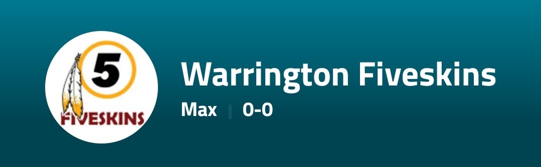
A Rebrand that has not been without controvesy, the Warrington Fiveskins have returned to the MLL. A vintage org name which has enjoyed much success elsewhere, GM Holland will be hoping that these former successes can be translated into a title in the MLL in 2021. As for the logo itself, by all accounts its much improved on the org’s 2020 effort.
There’s nowhere to hide for the Fiveskins now, the dust has settled and a title challenge has to be the goal. with a logo like this they are on track to do it. 8/10
4. OJs White Broncos
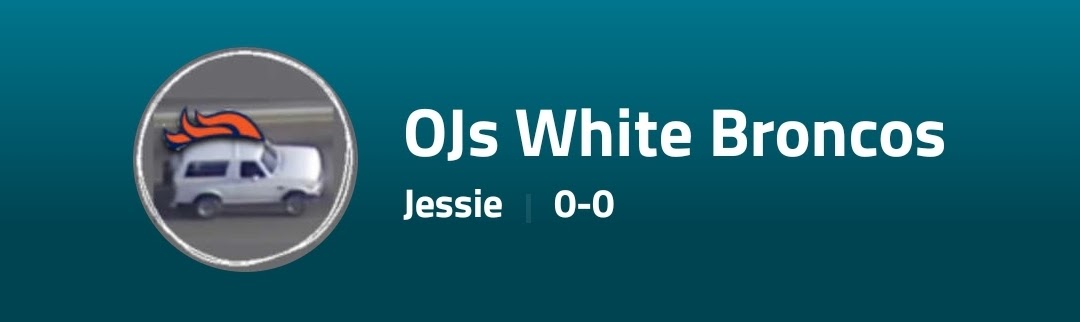
After a respectable 2020 Season, the commish has gone for a fresh look here and its paid off. The edgy and satirical approach is a big improvement from last years niche and confusing branding, and the Broncos will be hoping that this pushes them onto a better finish in 2021.
The logo itself is respectable but some have questioned if its a copy and paste job- if it is its a good one since MLL researchers could not locate the source material. There will still be some doubts but in the absence of evidence marks are high 7/10
5. Mahomes Alone
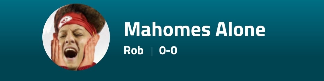
Going to put as much effort into the review as GM Harvey did on the rebrand. Pathetic 1/10
6. Sutton Street 36ers
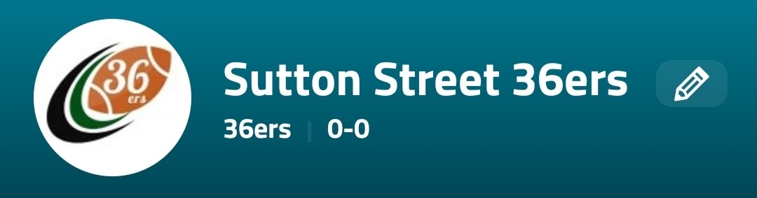
Vast changes were needed at the Todds following a dismal 2020 campaign, but if the rebrand is anything to go by 2021 could be something special. Clean visuals and a name which harks back to the GM and the great city of Philadelphia, there’s a lot to like here. The 36ers will look stunning propping up the table after the franchise RB tears his ACL. 10/10
Some clear winners and clear losers, but whatever happens, with D-Day looming closer it promises to be a bumper 2021 season
